> ## Documentation Index
> Fetch the complete documentation index at: https://docs.hotfix.jobs/llms.txt
> Use this file to discover all available pages before exploring further.
> ## Agent Instructions
> Product noun is jobs.
> MCP at https://rest.hotfix.jobs/mcp is the hiring contract for agents. Clients sign in with Hotfix; API keys are for HTTP only.
> Do not invent unpublished REST or hiring stats. Webhooks are set up in the app; there is no REST route or MCP tool to manage them.
> Do not mention Greenhouse, Ashby, Quick Apply, or claim.
> Creating a draft, offer, or booking link does not send email.
# Style your embed
> Make the embed look like the rest of your site: settings for the basics, snippet attributes for one page, and your own stylesheet for every part.
The embed sits on your own site, so it should look like it belongs there. There are three ways to style it, from simplest to most complete:
1. **Settings** in the app, for layout, accent, font, and corners.
2. **Attributes on the snippet**, to change those for one embed.
3. **Your own stylesheet**, to restyle every part.
All three change only the embed. Your company page and job pages on hotfix.jobs keep Hotfix's own look.
## Settings
Set the basics in the app under **Settings** > **Embed** > **Appearance**.
| Setting | Options |
| - | - |
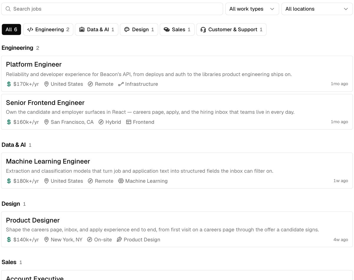
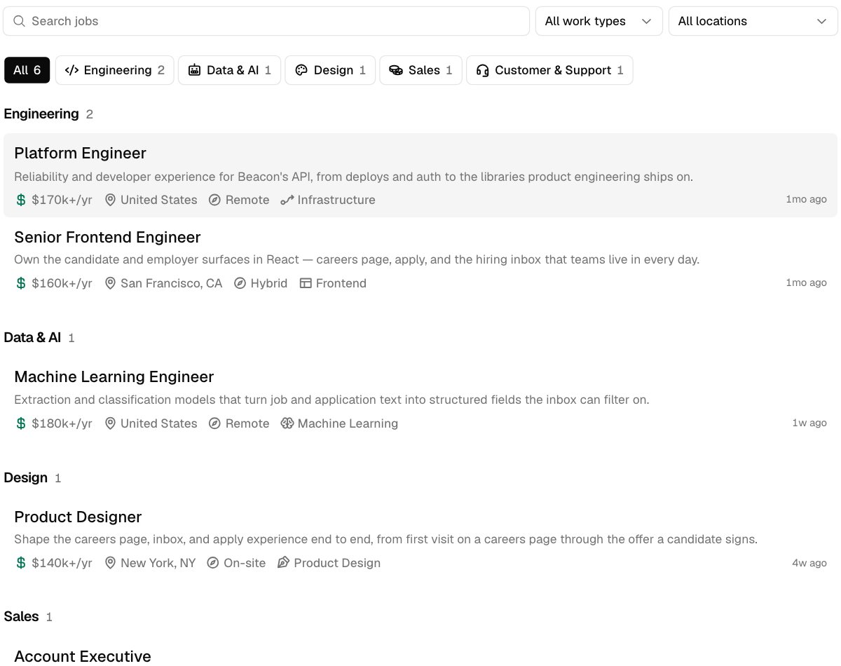
| Layout | Cards (default), or Rows: one column of jobs without card backgrounds or lines, each highlighted on hover |
| Accent | Any hex color. Used for the Apply buttons. |
| Font | Geist (default), Inter, Roboto, Open Sans, Lato, Montserrat, Poppins, Nunito Sans, Work Sans, Manrope, Plus Jakarta Sans, DM Sans, IBM Plex Sans, Source Serif, Merriweather, Lora, Playfair Display, or System |
| Corners | Rounded (default), Square, which removes rounding everywhere, or Pill, which makes buttons and fields fully round |
| Apply label | Auto (default), White, or Black |
The preview below the settings shows your embed with them and your stylesheets, on a light or dark page, before you save.
 ### Readable buttons
With the Apply label on Auto, the label is black or white, whichever is easier to read on your accent. If neither reads well, the button keeps the standard dark style instead of your accent.
Pick White or Black to match the buttons on your own site. Your choice is kept as long as it has at least 3:1 contrast with the accent. Below that, the readable color is used. White on yellow, for example, shows black. The preview in **Settings** > **Embed** says when this happens.
## On a dark page
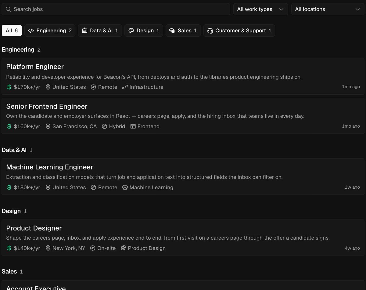
The embed's background is transparent, so your page shows through. On a dark page, add `data-theme="dark"` to the snippet for light text and dark controls, or `data-theme="auto"` to follow your visitor's light or dark setting.
### Readable buttons
With the Apply label on Auto, the label is black or white, whichever is easier to read on your accent. If neither reads well, the button keeps the standard dark style instead of your accent.
Pick White or Black to match the buttons on your own site. Your choice is kept as long as it has at least 3:1 contrast with the accent. Below that, the readable color is used. White on yellow, for example, shows black. The preview in **Settings** > **Embed** says when this happens.
## On a dark page
The embed's background is transparent, so your page shows through. On a dark page, add `data-theme="dark"` to the snippet for light text and dark controls, or `data-theme="auto"` to follow your visitor's light or dark setting.
 ## Override on one site
To use a different look in one embed, add attributes to its script tag. Each one replaces that setting for this embed only. Settings you don't override keep what you saved.
| Attribute | Values |
| - | - |
| `data-layout` | `cards` (default) or `rows` |
| `data-font` | `geist`, `inter`, `roboto`, `open-sans`, `lato`, `montserrat`, `poppins`, `nunito-sans`, `work-sans`, `manrope`, `plus-jakarta-sans`, `dm-sans`, `ibm-plex-sans`, `source-serif`, `merriweather`, `lora`, `playfair-display`, `system` |
| `data-radius` | `square`, `rounded`, `pill` |
| `data-accent` | A hex color like `#1F6B4A` |
| `data-accent-text` | `auto`, `white`, or `black` |
| `data-theme` | `light` (default), `dark` for a dark page, or `auto` to follow the visitor's light or dark setting |
For example:
```html theme={null}
```
An unknown value is ignored, and the saved setting is used.
## Your own stylesheet
To restyle the embed beyond these settings, add up to 3 stylesheets in **Settings** > **Embed** > **Embed options** > **Stylesheets**. Each must be an `https` URL on your own site. Every embed loads them, and they win over Hotfix's styles without `!important`.
Target the `data-hf` attributes listed under [Every part](#every-part) rather than class names, which can change at any time. The [theme variables](#theme-variables) change colors and corners everywhere at once.
To keep what candidates type in the apply form private, a stylesheet can't load anything from outside Hotfix:
* Images must be `data:` URLs, like the icon in [Your own icon](#your-own-icon).
* Fonts must be `data:` URLs inside your stylesheet, or one of the fonts in **Settings**. A font file linked from another site won't load.
* An image in a job description that's hosted elsewhere won't show in the embed.
## Recipes
Each recipe is a complete stylesheet. Combine them, or use them as a starting point.
### Lines between rows
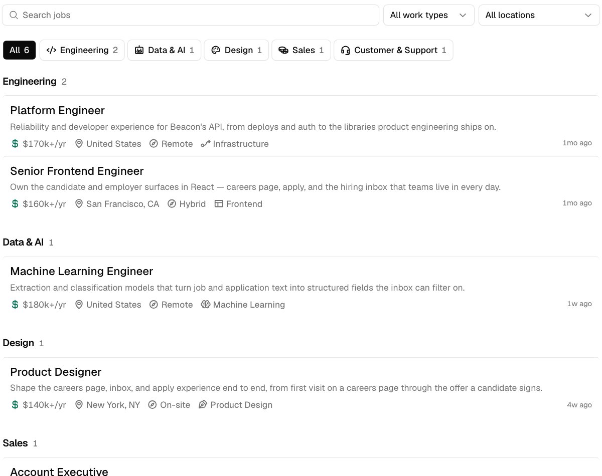
With **Layout** set to Rows, add lines between jobs and take away the highlight.
```css theme={null}
[data-hf="job-card"] {
border-top: 1px solid #e5e5e5;
border-radius: 0;
}
[data-hf="job-card"]:hover {
background: none;
}
```
## Override on one site
To use a different look in one embed, add attributes to its script tag. Each one replaces that setting for this embed only. Settings you don't override keep what you saved.
| Attribute | Values |
| - | - |
| `data-layout` | `cards` (default) or `rows` |
| `data-font` | `geist`, `inter`, `roboto`, `open-sans`, `lato`, `montserrat`, `poppins`, `nunito-sans`, `work-sans`, `manrope`, `plus-jakarta-sans`, `dm-sans`, `ibm-plex-sans`, `source-serif`, `merriweather`, `lora`, `playfair-display`, `system` |
| `data-radius` | `square`, `rounded`, `pill` |
| `data-accent` | A hex color like `#1F6B4A` |
| `data-accent-text` | `auto`, `white`, or `black` |
| `data-theme` | `light` (default), `dark` for a dark page, or `auto` to follow the visitor's light or dark setting |
For example:
```html theme={null}
```
An unknown value is ignored, and the saved setting is used.
## Your own stylesheet
To restyle the embed beyond these settings, add up to 3 stylesheets in **Settings** > **Embed** > **Embed options** > **Stylesheets**. Each must be an `https` URL on your own site. Every embed loads them, and they win over Hotfix's styles without `!important`.
Target the `data-hf` attributes listed under [Every part](#every-part) rather than class names, which can change at any time. The [theme variables](#theme-variables) change colors and corners everywhere at once.
To keep what candidates type in the apply form private, a stylesheet can't load anything from outside Hotfix:
* Images must be `data:` URLs, like the icon in [Your own icon](#your-own-icon).
* Fonts must be `data:` URLs inside your stylesheet, or one of the fonts in **Settings**. A font file linked from another site won't load.
* An image in a job description that's hosted elsewhere won't show in the embed.
## Recipes
Each recipe is a complete stylesheet. Combine them, or use them as a starting point.
### Lines between rows
With **Layout** set to Rows, add lines between jobs and take away the highlight.
```css theme={null}
[data-hf="job-card"] {
border-top: 1px solid #e5e5e5;
border-radius: 0;
}
[data-hf="job-card"]:hover {
background: none;
}
```
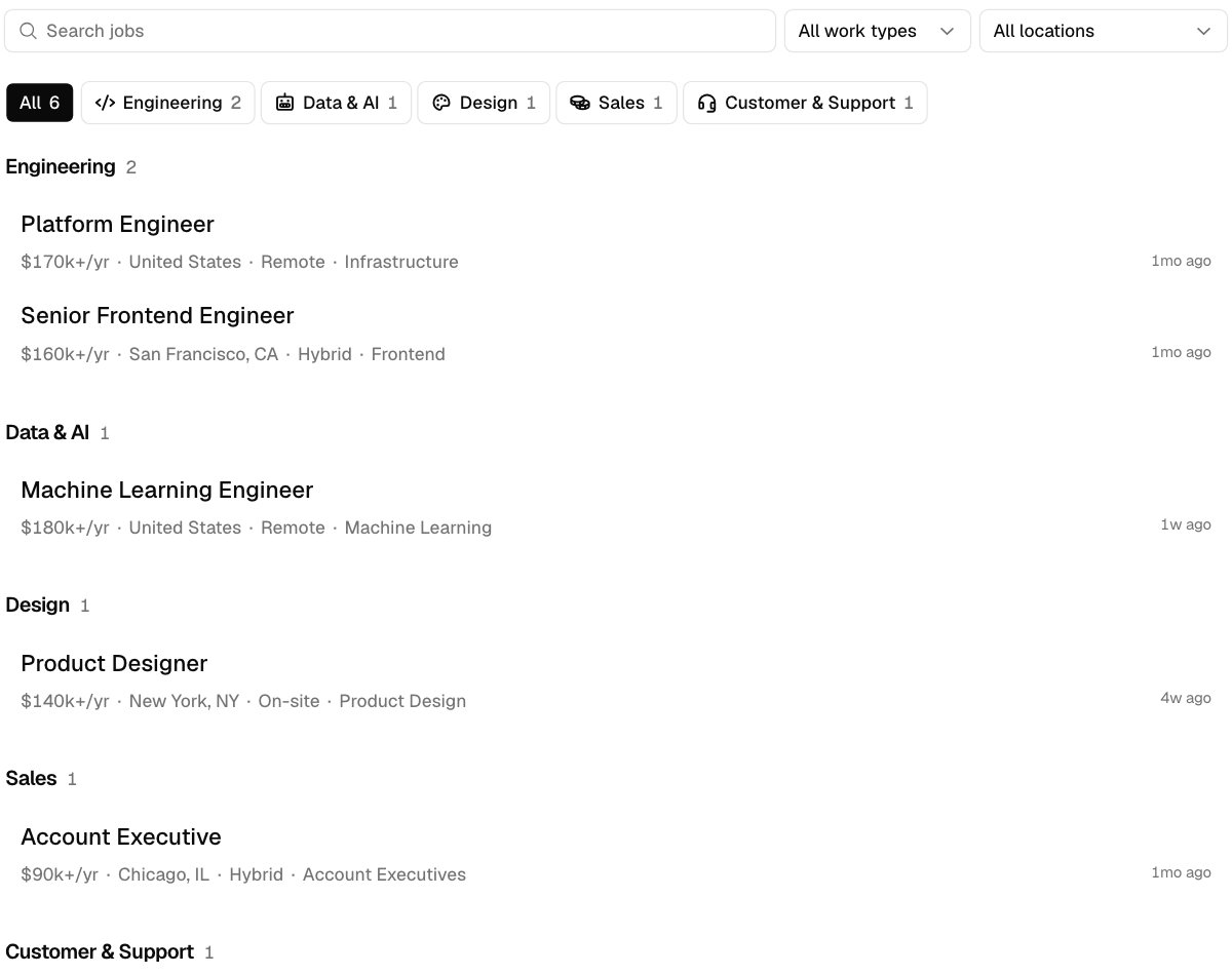
 ### Titles and details only
Hide the summaries and icons, and put a dot between details.
```css theme={null}
[data-hf="job-summary"],
[data-hf="fact-icon"] {
display: none;
}
[data-hf="facts"] {
column-gap: 6px;
}
[data-hf="fact"] + [data-hf="fact"]::before {
content: "·";
margin-right: 2px;
}
```
### Titles and details only
Hide the summaries and icons, and put a dot between details.
```css theme={null}
[data-hf="job-summary"],
[data-hf="fact-icon"] {
display: none;
}
[data-hf="facts"] {
column-gap: 6px;
}
[data-hf="fact"] + [data-hf="fact"]::before {
content: "·";
margin-right: 2px;
}
```
 To keep one icon, such as salary's, hide the rest instead:
```css theme={null}
[data-hf="fact"]:not([data-fact="salary"]) [data-hf="fact-icon"] {
display: none;
}
```
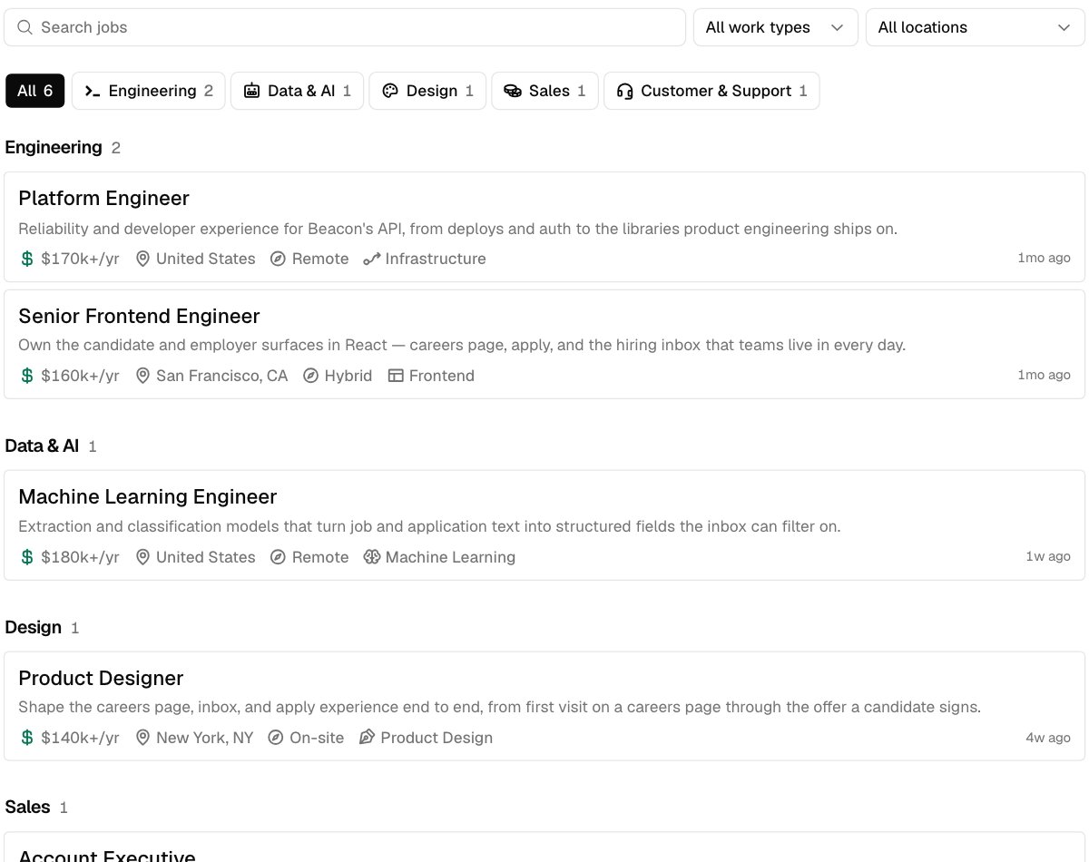
### Your own icon
Hide a department button's icon and draw your own. As a mask, the icon takes the button's text color, chosen or not.
```css theme={null}
[data-department="engineering"] [data-hf="department-icon"] {
display: none;
}
[data-department="engineering"]::before {
content: "";
width: 16px;
height: 16px;
background: currentColor;
mask: url("data:image/svg+xml,%3Csvg xmlns='http://www.w3.org/2000/svg' viewBox='0 0 16 16'%3E%3Cpath d='M2 4l4 4-4 4M8 12h6' stroke='black' stroke-width='2' fill='none'/%3E%3C/svg%3E")
center / contain no-repeat;
}
```
To keep one icon, such as salary's, hide the rest instead:
```css theme={null}
[data-hf="fact"]:not([data-fact="salary"]) [data-hf="fact-icon"] {
display: none;
}
```
### Your own icon
Hide a department button's icon and draw your own. As a mask, the icon takes the button's text color, chosen or not.
```css theme={null}
[data-department="engineering"] [data-hf="department-icon"] {
display: none;
}
[data-department="engineering"]::before {
content: "";
width: 16px;
height: 16px;
background: currentColor;
mask: url("data:image/svg+xml,%3Csvg xmlns='http://www.w3.org/2000/svg' viewBox='0 0 16 16'%3E%3Cpath d='M2 4l4 4-4 4M8 12h6' stroke='black' stroke-width='2' fill='none'/%3E%3C/svg%3E")
center / contain no-repeat;
}
```
 A job's details work the same way, with `[data-fact="team"]` and its `fact-icon`. To remove every department icon, hide `[data-hf="department-icon"]`.
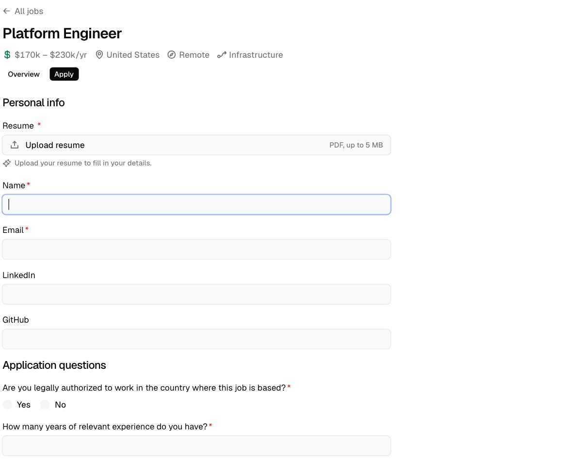
### The apply form in your colors
Set the focus ring, field borders, and field background, and fill chosen answers with your color.
```css theme={null}
html:root {
--hf-focus: #2563eb;
--hf-edge-field: #cbd5e1;
--hf-surface-raised: #f8fafc;
}
[data-hf="field-label"] {
font-weight: 400;
}
[data-hf="radio"][data-checked],
[data-hf="checkbox"][data-checked] {
background: #2563eb;
}
```
A job's details work the same way, with `[data-fact="team"]` and its `fact-icon`. To remove every department icon, hide `[data-hf="department-icon"]`.
### The apply form in your colors
Set the focus ring, field borders, and field background, and fill chosen answers with your color.
```css theme={null}
html:root {
--hf-focus: #2563eb;
--hf-edge-field: #cbd5e1;
--hf-surface-raised: #f8fafc;
}
[data-hf="field-label"] {
font-weight: 400;
}
[data-hf="radio"][data-checked],
[data-hf="checkbox"][data-checked] {
background: #2563eb;
}
```
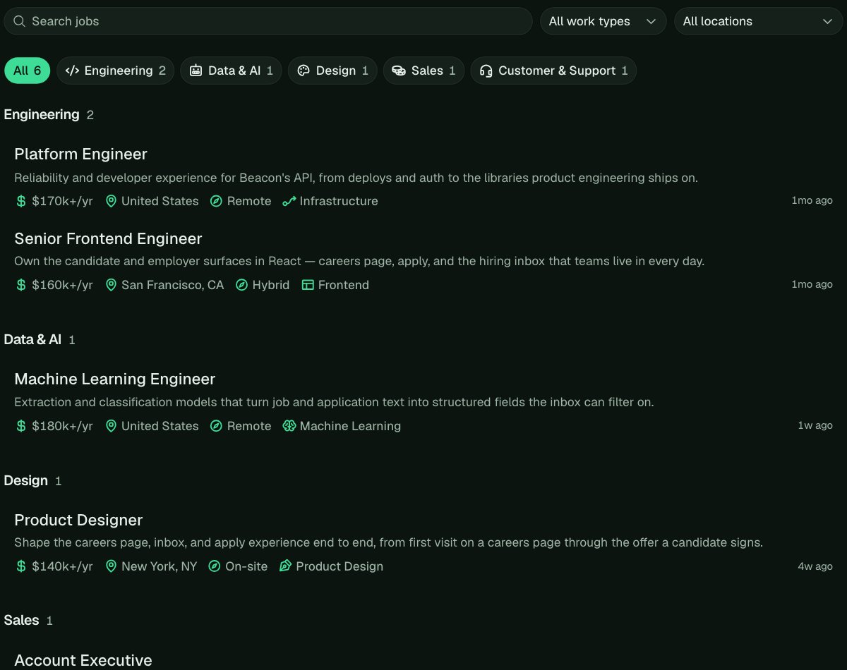
 ### A whole brand
With `data-theme="dark"` and `data-layout="rows"` on the snippet, the theme variables carry your colors through buttons, fields, menus, and focus rings.
```css theme={null}
html:root {
--hf-ink: #e8f0ea;
--hf-ink-muted: #9fb5a7;
--hf-edge: #23352b;
--hf-edge-field: #2e4537;
--hf-surface-raised: #142019;
--hf-surface-overlay: #142019;
--hf-control: #1a2a21;
--hf-control-hover: #213429;
--hf-commit: #3ddc97;
--hf-ink-inverse: #0c1410;
--hf-focus: #3ddc97;
}
[data-hf="job-title"] a {
font-weight: 500;
}
[data-hf="fact-icon"] {
color: #3ddc97;
}
```
### A whole brand
With `data-theme="dark"` and `data-layout="rows"` on the snippet, the theme variables carry your colors through buttons, fields, menus, and focus rings.
```css theme={null}
html:root {
--hf-ink: #e8f0ea;
--hf-ink-muted: #9fb5a7;
--hf-edge: #23352b;
--hf-edge-field: #2e4537;
--hf-surface-raised: #142019;
--hf-surface-overlay: #142019;
--hf-control: #1a2a21;
--hf-control-hover: #213429;
--hf-commit: #3ddc97;
--hf-ink-inverse: #0c1410;
--hf-focus: #3ddc97;
}
[data-hf="job-title"] a {
font-weight: 500;
}
[data-hf="fact-icon"] {
color: #3ddc97;
}
```
 ### Different words
To reword something, hide its words and add your own. Screen readers still read Hotfix's words, so keep the meaning the same.
```css theme={null}
[data-hf="resume-upload-label"] {
font-size: 0;
}
[data-hf="resume-upload-label"]::after {
content: "Attach your CV";
font-size: 14px;
}
```
## Theme variables
To change colors and corners everywhere at once, including buttons, fields, menus, and focus rings, set these variables on `html:root`. That selector wins over Hotfix's light and dark defaults.
| Variable | What it colors |
| - | - |
| `--hf-ink` | Text |
| `--hf-ink-muted` | Secondary text, like a job's details |
| `--hf-commit` and `--hf-ink-inverse` | A chosen department and the open tab, and their text |
| `--hf-control` and `--hf-control-hover` | Other buttons, and their hover |
| `--hf-surface-raised` | Fields and cards |
| `--hf-surface-overlay` | Dropdown menus |
| `--hf-selected` | The chosen option in a menu |
| `--hf-edge` | Lines between parts |
| `--hf-edge-field` | Field borders |
| `--hf-focus` | Focus rings |
| `--hf-invalid` | Errors and required marks |
| `--hf-radius-control`, `--hf-radius-field`, `--hf-radius-panel` | Corners, from smallest to largest |
**Accent** and **Corners** in **Settings** > **Embed** (or `data-accent` and `data-radius` on the snippet) still decide the Apply and submit buttons and the overall corner style.
## Every part
Every part of the embed has a `data-hf` attribute. Some also say what they are or what state they're in, like `data-active` on the chosen department.
### The job list
| Attribute | What it marks |
| - | - |
| `[data-hf="job-list"]` | The job list |
| `[data-hf="job-filters"]` | The search and filter row |
| `[data-hf="job-search"]` | The search box |
| `[data-hf="job-filter"]` | A filter dropdown, with `data-filter` set to `work-type` or `location` |
| `[data-hf="department-filter"]` | The department buttons |
| `[data-hf="department"]` | One department button, with `data-department` like `engineering` (`all` for All). The chosen one has `data-active` |
| `[data-hf="department-icon"]` | A department button's icon |
| `[data-hf="group"]` | A department's jobs, like Engineering |
| `[data-hf="group-heading"]` | A department's heading |
| `[data-hf="group-count"]` | The number of jobs beside a department's heading |
| `[data-hf="team-heading"]` | A team's heading inside a large department |
| `[data-hf="job-grid"]` | The grid that holds a group's jobs |
| `[data-hf="job"]` | One job, in the list or on its own page |
| `[data-hf="job-card"]` | A job's card or row: its background, border, corners, and padding |
| `[data-hf="job-title"]` | The job's title |
| `[data-hf="job-summary"]` | The job's short summary |
| `[data-hf="job-meta"]` | The job's details |
| `[data-hf="facts"]` | The row of details. Set `column-gap` here to space them |
| `[data-hf="fact"]` | One detail, with `data-fact` set to `salary`, `location`, `work-type`, `team`, `experience`, `posted`, or `new` |
| `[data-hf="fact-icon"]` | A detail's icon |
| `[data-hf="job-posted"]` | When a job was posted |
| `[data-hf="more-jobs"]` | The button that loads more jobs |
| `[data-hf="jobs-empty"]` | The message when there are no jobs, or none match the search |
### A job's page
| Attribute | What it marks |
| - | - |
| `[data-hf="job-back"]` | The link back to all jobs |
| `[data-hf="job-header"]` | The top of a job page: title, details, and tabs |
| `[data-hf="job-tabs"]` | The Overview and Apply tabs; each is `job-tab`, and the open one has `data-active` |
| `[data-hf="job-apply"]` | The Apply tab, until it is open |
| `[data-hf="job-overview"]` | The description |
| `[data-hf="job-closed"]` | The notice on a job that no longer takes applications |
| `[data-hf="tooltip"]` | The hover note that lists every place when a job has several |
A job's description is plain HTML from Markdown (headings, `p`, `ul`, `ol`, `li`, `a`, `strong`, `em`, `blockquote`, `code`, and tables), so style those tags inside `job-overview`.
### The apply form
| Attribute | What it marks |
| - | - |
| `[data-hf="job-application"]` | The apply form's area |
| `[data-hf="apply-form"]` | The form itself |
| `[data-hf="apply-section"]` | A part of the form, with `data-section` set to `personal`, `questions`, or `compliance` |
| `[data-hf="apply-section-heading"]` | A part's heading |
| `[data-hf="apply-disclosure"]` | The note above the voluntary questions |
| `[data-hf="apply-field"]` | One question, with `data-field-type` (`resume`, `text`, `email`, `phone`, `url`, `number`, `textarea`, `single_select`, `multi_select`, `boolean`, `date`, `file`) and `data-invalid` when it has an error |
| `[data-hf="field-label"]` | A question's label |
| `[data-hf="field-required"]` | The mark on a required question |
| `[data-hf="field-help"]` | A question's help text |
| `[data-hf="field-control"]` | The box you type or choose in: a text, email, phone, link, number, date, or long-text field, or a dropdown |
| `[data-hf="option"]` | One choice with its label. Inside it, `radio` or `checkbox`, which has `data-checked` when chosen |
| `[data-hf="field-error"]` | A question's error message |
| `[data-hf="resume-upload"]` | The Upload resume button, with `data-dragging` while a file is dragged over it. Inside it: `resume-upload-icon`, `resume-upload-label`, and `resume-upload-hint` (PDF, up to 5 MB) |
| `[data-hf="resume-file"]` | The chosen resume, with `resume-remove` to take it off |
| `[data-hf="file-upload"]` | A file question's drop area, with `data-drag-over` while a file is dragged over it |
| `[data-hf="file-attached"]` | A chosen file, with `file-remove` to take it off |
| `[data-hf="apply-submit"]` | The submit button. It's `:disabled` while required questions are empty and while the form sends |
| `[data-hf="apply-error"]` | An error about the whole form |
| `[data-hf="apply-loading"]` | The form while it loads |
### After they apply
| Attribute | What it marks |
| - | - |
| `[data-hf="apply-confirm"]` | The step where the candidate enters the code from their email |
| `[data-hf="code-input"]` | The code boxes. Each box is `code-input-digit` |
| `[data-hf="code-status"]` | The message under the code: sent, or what went wrong |
| `[data-hf="code-resend"]` | The Resend code button |
| `[data-hf="apply-success"]` | The message after they apply |
| `[data-hf="apply-already"]` | The message when the candidate has already applied |
| `[data-hf="apply-unavailable"]` | The message when a job can't take applications on Hotfix, with a button to apply on your site |
### Menus and the rest
| Attribute | What it marks |
| - | - |
| `[data-hf="menu"]` | A dropdown's menu. Each option is `menu-item`, with `data-highlighted` under the pointer or keyboard and `data-selected` when chosen |
| `[data-hf="menu-check"]` | The check beside the chosen option |
| `[data-hf="credit"]` | The Powered by Hotfix line. You can change its color, size, and spacing, but it must stay visible |
## What you can't change
* **The order of things.** A stylesheet can hide and restyle parts, not move them around. The order of your questions comes from **Settings** > **Apply**.
* **Your own text blocks.** Beyond rewording, the text you can add is the opening and closing on every job. See [Opening and closing on every job](/company-page#opening-and-closing-on-every-job).
* **Outside fonts and images.** They have to be inside your stylesheet as `data:` URLs.
* **A date field's calendar.** It's your visitor's browser's own.
* **The credit.** Powered by Hotfix stays visible.
## Related
* [Company page and embed](/company-page)
* [Apply settings](/help/apply-settings)
This documentation is built and hosted on [Mintlify](https://mintlify.com), a developer documentation platform.
### Different words
To reword something, hide its words and add your own. Screen readers still read Hotfix's words, so keep the meaning the same.
```css theme={null}
[data-hf="resume-upload-label"] {
font-size: 0;
}
[data-hf="resume-upload-label"]::after {
content: "Attach your CV";
font-size: 14px;
}
```
## Theme variables
To change colors and corners everywhere at once, including buttons, fields, menus, and focus rings, set these variables on `html:root`. That selector wins over Hotfix's light and dark defaults.
| Variable | What it colors |
| - | - |
| `--hf-ink` | Text |
| `--hf-ink-muted` | Secondary text, like a job's details |
| `--hf-commit` and `--hf-ink-inverse` | A chosen department and the open tab, and their text |
| `--hf-control` and `--hf-control-hover` | Other buttons, and their hover |
| `--hf-surface-raised` | Fields and cards |
| `--hf-surface-overlay` | Dropdown menus |
| `--hf-selected` | The chosen option in a menu |
| `--hf-edge` | Lines between parts |
| `--hf-edge-field` | Field borders |
| `--hf-focus` | Focus rings |
| `--hf-invalid` | Errors and required marks |
| `--hf-radius-control`, `--hf-radius-field`, `--hf-radius-panel` | Corners, from smallest to largest |
**Accent** and **Corners** in **Settings** > **Embed** (or `data-accent` and `data-radius` on the snippet) still decide the Apply and submit buttons and the overall corner style.
## Every part
Every part of the embed has a `data-hf` attribute. Some also say what they are or what state they're in, like `data-active` on the chosen department.
### The job list
| Attribute | What it marks |
| - | - |
| `[data-hf="job-list"]` | The job list |
| `[data-hf="job-filters"]` | The search and filter row |
| `[data-hf="job-search"]` | The search box |
| `[data-hf="job-filter"]` | A filter dropdown, with `data-filter` set to `work-type` or `location` |
| `[data-hf="department-filter"]` | The department buttons |
| `[data-hf="department"]` | One department button, with `data-department` like `engineering` (`all` for All). The chosen one has `data-active` |
| `[data-hf="department-icon"]` | A department button's icon |
| `[data-hf="group"]` | A department's jobs, like Engineering |
| `[data-hf="group-heading"]` | A department's heading |
| `[data-hf="group-count"]` | The number of jobs beside a department's heading |
| `[data-hf="team-heading"]` | A team's heading inside a large department |
| `[data-hf="job-grid"]` | The grid that holds a group's jobs |
| `[data-hf="job"]` | One job, in the list or on its own page |
| `[data-hf="job-card"]` | A job's card or row: its background, border, corners, and padding |
| `[data-hf="job-title"]` | The job's title |
| `[data-hf="job-summary"]` | The job's short summary |
| `[data-hf="job-meta"]` | The job's details |
| `[data-hf="facts"]` | The row of details. Set `column-gap` here to space them |
| `[data-hf="fact"]` | One detail, with `data-fact` set to `salary`, `location`, `work-type`, `team`, `experience`, `posted`, or `new` |
| `[data-hf="fact-icon"]` | A detail's icon |
| `[data-hf="job-posted"]` | When a job was posted |
| `[data-hf="more-jobs"]` | The button that loads more jobs |
| `[data-hf="jobs-empty"]` | The message when there are no jobs, or none match the search |
### A job's page
| Attribute | What it marks |
| - | - |
| `[data-hf="job-back"]` | The link back to all jobs |
| `[data-hf="job-header"]` | The top of a job page: title, details, and tabs |
| `[data-hf="job-tabs"]` | The Overview and Apply tabs; each is `job-tab`, and the open one has `data-active` |
| `[data-hf="job-apply"]` | The Apply tab, until it is open |
| `[data-hf="job-overview"]` | The description |
| `[data-hf="job-closed"]` | The notice on a job that no longer takes applications |
| `[data-hf="tooltip"]` | The hover note that lists every place when a job has several |
A job's description is plain HTML from Markdown (headings, `p`, `ul`, `ol`, `li`, `a`, `strong`, `em`, `blockquote`, `code`, and tables), so style those tags inside `job-overview`.
### The apply form
| Attribute | What it marks |
| - | - |
| `[data-hf="job-application"]` | The apply form's area |
| `[data-hf="apply-form"]` | The form itself |
| `[data-hf="apply-section"]` | A part of the form, with `data-section` set to `personal`, `questions`, or `compliance` |
| `[data-hf="apply-section-heading"]` | A part's heading |
| `[data-hf="apply-disclosure"]` | The note above the voluntary questions |
| `[data-hf="apply-field"]` | One question, with `data-field-type` (`resume`, `text`, `email`, `phone`, `url`, `number`, `textarea`, `single_select`, `multi_select`, `boolean`, `date`, `file`) and `data-invalid` when it has an error |
| `[data-hf="field-label"]` | A question's label |
| `[data-hf="field-required"]` | The mark on a required question |
| `[data-hf="field-help"]` | A question's help text |
| `[data-hf="field-control"]` | The box you type or choose in: a text, email, phone, link, number, date, or long-text field, or a dropdown |
| `[data-hf="option"]` | One choice with its label. Inside it, `radio` or `checkbox`, which has `data-checked` when chosen |
| `[data-hf="field-error"]` | A question's error message |
| `[data-hf="resume-upload"]` | The Upload resume button, with `data-dragging` while a file is dragged over it. Inside it: `resume-upload-icon`, `resume-upload-label`, and `resume-upload-hint` (PDF, up to 5 MB) |
| `[data-hf="resume-file"]` | The chosen resume, with `resume-remove` to take it off |
| `[data-hf="file-upload"]` | A file question's drop area, with `data-drag-over` while a file is dragged over it |
| `[data-hf="file-attached"]` | A chosen file, with `file-remove` to take it off |
| `[data-hf="apply-submit"]` | The submit button. It's `:disabled` while required questions are empty and while the form sends |
| `[data-hf="apply-error"]` | An error about the whole form |
| `[data-hf="apply-loading"]` | The form while it loads |
### After they apply
| Attribute | What it marks |
| - | - |
| `[data-hf="apply-confirm"]` | The step where the candidate enters the code from their email |
| `[data-hf="code-input"]` | The code boxes. Each box is `code-input-digit` |
| `[data-hf="code-status"]` | The message under the code: sent, or what went wrong |
| `[data-hf="code-resend"]` | The Resend code button |
| `[data-hf="apply-success"]` | The message after they apply |
| `[data-hf="apply-already"]` | The message when the candidate has already applied |
| `[data-hf="apply-unavailable"]` | The message when a job can't take applications on Hotfix, with a button to apply on your site |
### Menus and the rest
| Attribute | What it marks |
| - | - |
| `[data-hf="menu"]` | A dropdown's menu. Each option is `menu-item`, with `data-highlighted` under the pointer or keyboard and `data-selected` when chosen |
| `[data-hf="menu-check"]` | The check beside the chosen option |
| `[data-hf="credit"]` | The Powered by Hotfix line. You can change its color, size, and spacing, but it must stay visible |
## What you can't change
* **The order of things.** A stylesheet can hide and restyle parts, not move them around. The order of your questions comes from **Settings** > **Apply**.
* **Your own text blocks.** Beyond rewording, the text you can add is the opening and closing on every job. See [Opening and closing on every job](/company-page#opening-and-closing-on-every-job).
* **Outside fonts and images.** They have to be inside your stylesheet as `data:` URLs.
* **A date field's calendar.** It's your visitor's browser's own.
* **The credit.** Powered by Hotfix stays visible.
## Related
* [Company page and embed](/company-page)
* [Apply settings](/help/apply-settings)
This documentation is built and hosted on [Mintlify](https://mintlify.com), a developer documentation platform.